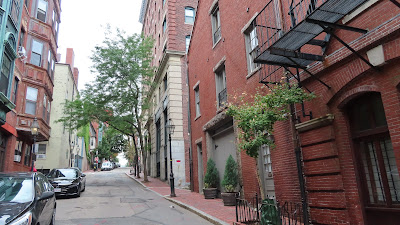
A scenic view of one of the beautiful streets of Beacon Hill. See how the path is winding across the red-grey brick combination. The corner of two buildings gives shape to a small plaza with trees and climbers. The iron fence is to delineate, not to restrict the entrance to a quiet retreat.
I have visited Boston- Massachusetts two weeks ago, with the intention of keeping my training as an architect and urban researcher, learning about its urban morphology, the buildings technology, and its urban landscape-hardscape; every design is so different from what I currently see in Los Angeles, CA.
I had not the time to enjoy the interior architecture of the most important buildings, except the State House, my focus was mainly on urban impressions.
Compared to Los Angeles, what I really appreciated is the human scale of every passage, alley, street, avenue, so full of domesticity regardless the skyscrapers height. It is a virtue not seen in Los Angeles, the city of the cars, with huge walls as basements, so unfriendly for pedestrians, mostly in Summer.
I am sharing some of my hundreds pictures with captions of my impressions. All pictures were taken in August 2022 and belong to my archives. Please do not share without permission.
Urban planters with flowers, the black matching the entrance of the train station.
The metal fence is more a decorative prevention device as the level is lower inside the planters. I can't help noticing the trash can due to the lack of design, after reading the story of the design competition for expensive-fancy trash cans in San Francisco.
Rectangular planters next to the pool and Brutalist buildings at the Christian Science Plaza. The planters have incorporated seats.
Christian Science Plaza. Another walk-through view, a serial vision in the words of Gordon Cullen. Here, the church at the end of the perspective, the hemicycle and continuous never ending seating at the edge of the lawn.
The Children's Museum at the waterfront. The concrete and glass is extended and attached like a modern screen in front of the typical brick Boston building. See the floor design adjacent to the deck.
Floor design patterns is everywhere, and so beautiful to see. Here and there, some gray planters. The lamp posts have a contemporary design, pretty much different from all others in Downton Boston.
The monolithic sculptural stones in front of the Children's Museum, they somehow remind me of Stonehenge.
A small plaza and playground before discovering the waterfront.
In areas of contemporary development, the skyscrapers are separated with relax areas. Note the floor textures and the equipment color so bright in contrast with the buildings facades.
An avenue close to the previous picture. A colorful contemporary sculpture surrounded by native landscape, the lamp post caught my attention as old fashioned. Some Eclecticism is welcome here.
Same contemporary neighborhood. This so modern urban sculpture has been surrounded by a guardrail, obviously it has been a bad choice since the "spikes" may be dangerous for passers-by. I think the City should remove it, to the regret of the artist. I see it as the "anti Feng-Shui". :)
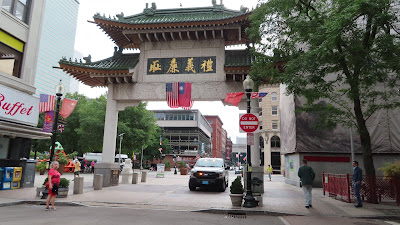
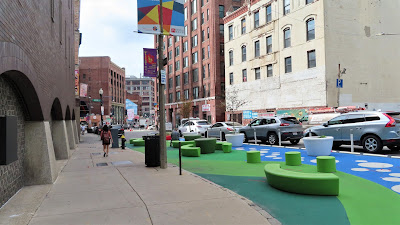
Chinatown. The Asian lion and some domestic planters here and there, as a limit of the colorful street playground. I think this street is confusing, the floor is so plain that it could be not meant for pedestrians.
In continuation with the previous picture caption, see what happens when the street and pedestrian areas look the same.
A planter in Boston Chinatown. I am wondering if the store owner added it to embellish the store?
The most accomplished urban design in Chinatown, it does not need too much explanation. See the picture is taken in Summer and though the colors are nice, the lack of shadow-trees-plants, make the place uninviting. One does not want to be sitting there in plain sun for in the hard Winter.
The Massachusetts State House at the end of the perspective, this is Boston Common Park, usually called "Boston Commons". I was chatting with a colleague-friend in real time and we had a good laugh when he asked me "Who planted this tree??".
Beautiful Beacon Hill street again, even though the sidewalks are narrow, the gate has two pines next to it. Very nice detail. I have also seen planters with flowers below the windows everywhere in Beacon Hill. Some of them were plastic plants, I assume due to the hard Winter.
Downtown Boston planters with longitudinal stones as seats.
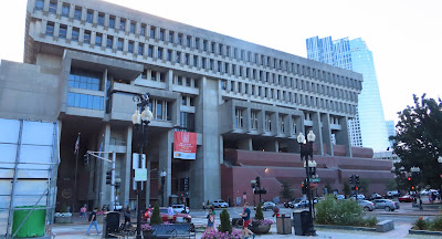
Boston City Hall. Same planters, in combination with round ones full of Summer flowers. As a side note, people has criticized this Brutalist building, up to the point of calling it the ugliest building in the world, per Wikipedia. My colleague friend and me find it amazing.
The plaza around Quincy Market. The plain planters are used as seats as well.
Quincy Market again. With the planters, pop up stands and longitudinal stone seating. See the lamp posts with flowers pots, they are everywhere. I see them as a domestic feature, nevertheless all elements are adding human scale. The place is alive without a doubt.
Quincy Market across the historical market. See the floor textures and patterns.
The Pandemics pop-up dining areas. I like how they include real hanging plants. I have seen too much plastic plants in Southern California pops-up.
The flat contemporary fountain with the recurrent stone seats around.
These sculptural poles have some inbuilt seats as well, or at least they look like seats. This plaza has an artisans fair on weekends. Conventional benches are added across.


