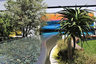
I am sharing this fountain design in Manhattan Village Mall which I find very interesting. When we think of a fountain, the first image that comes to our mind is a round shape, because this the typical historical fountain, or the standards on sale. But this one is designed in order to create a sort of path, though narrow, I could walk around. I don't remember if there was enough width for a wheelchair between the fountain and the hemicycle across the path, it seems not, an accessible path would have been a better solution to allow everybody to enjoy how it feels to walk or stroll along the landscape. It changes the perception of the hardscape related to nature.
I really like the pebbles at the bottom and the tree reflection on the water. It looks like the tree is emerging from the fountain, but it is not. The tree area is inviting to have a rest under the shadow, see the mall is very open and the sun hits very hard.
We can see here that the side path is not accessible, but maybe it was created just to have a technical separation between the fountain and the plants. People do not walk along the fountain but around and the effect of the "in between" water and plants is lost. Anyway I like the overall design.
All pictures by Myriam Mahiques, personal archives, May 2021. Please do not share without permission.


No comments:
Post a Comment